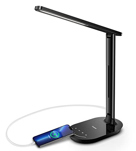
What Is Best Color Light for Reading Comfortably
What is best color light for reading isn’t just a technical question, it’s about how your eyes and brain work together when words start piling up on the page. Too much blue can feel sharp and overstimulating, while overly warm tones may make text look muddy after a while. Finding the sweet spot means balancing clarity, comfort, and long term eye health so reading doesn’t turn into a chore. Once the light feels right, your focus sticks around naturally instead of drifting off.
Many readers don’t realize that light color affects contrast as much as brightness does. A well chosen color temperature helps letters stand out cleanly against the background without forcing your eyes to work overtime. That subtle ease reduces squinting, headaches, and that tired feeling creeping in after a few chapters. Over time, this comfort builds better reading habits without conscious effort.
The best reading light color also depends on when and how you read. Evening readers often benefit from warmer tones that calm the nervous system, while daytime study sessions may call for cooler but controlled light. It’s not about extremes, it’s about a balanced tone that keeps you alert without feeling harsh. When lighting matches your rhythm, reading feels smooth instead of draining.
Modern lighting options make it easier than ever to fine tune this balance. Adjustable bulbs and lamps allow you to shift color temperature as your needs change. That flexibility turns one light into a tool that supports reading across different moods and times of day. Suddenly, the question isn’t complicated anymore, it’s practical and empowering.
Why color temperature shapes reading comfort
What is best color light for reading starts with color temperature because it directly affects how your eyes perceive text on a page. Light that is too cool can feel sharp and overly stimulating, while overly warm tones may blur letter edges and reduce contrast. This tension explains why many readers feel alert at first, then drained after longer sessions. When color temperature aligns with visual comfort, reading feels steady instead of exhausting.
Measured in kelvin, color temperature influences not just mood but visual clarity. Cooler light often boosts alertness, yet it can cause eye strain when used for extended reading. Warmer light soothes the nervous system but may lower perceived sharpness if pushed too far. The sweet spot sits in the middle, where contrast stays crisp and the eyes relax.
Readers who spend hours with books or screens often notice fatigue before they recognize lighting as the cause. A balanced tone helps your eyes maintain focus without constant micro adjustments. Over time, that balance reduces headaches and dryness. Choosing the right color temperature quietly supports endurance and enjoyment.
This is why the best reading setups rarely rely on a single fixed bulb. Adjustable lighting allows subtle shifts based on time of day and reading intensity. Flexibility becomes a hidden advantage, especially for long term habits. In short, color temperature sets the foundation for sustainable reading comfort.
Warm light benefits for evening and leisure reading
Warm light plays a gentle role when reading slows down after a long day. Its softer tone reduces stimulation and signals the brain to ease into rest mode. For many people, this makes what is best color light for reading in the evening lean toward warmer hues. The effect feels calming rather than dull.
Lower kelvin light minimizes blue light exposure, which is known to interfere with sleep cycles. Readers who unwind with novels before bed often experience smoother transitions to sleep under warm lighting. This benefit isn’t about brightness, but about spectral balance. Comfort comes from consistency rather than intensity.
However, warm light must still maintain sufficient contrast. If it’s too yellow, text can appear muddy and tiring. The key factor is moderation, keeping warmth without sacrificing legibility. That balance keeps leisure reading pleasant without visual strain.
Warm light also pairs well with cozy spaces like bedrooms and reading nooks. It blends naturally with ambient decor and reduces harsh shadows. When the environment feels inviting, reading sessions last longer. Comfort becomes part of the habit, not a distraction.
Neutral white light for focus and long sessions
Neutral white light often emerges as the practical answer to what is best color light for reading during focused tasks. It offers a balance between warmth and coolness, keeping text sharp without overstimulating the eyes. This balance supports concentration over extended periods. Many libraries and study rooms rely on this range for good reason.
Readers tackling textbooks or dense material benefit from consistent contrast. Neutral light helps letters stand out cleanly against the page, reducing rereading and mental fatigue. It keeps the brain engaged without pushing it into overdrive. That steadiness is crucial for productivity.
Unlike cooler tones, neutral white doesn’t create harsh glare on paper. It also avoids the drowsiness that overly warm light can bring during daytime reading. This makes it a versatile option for mixed use environments. One light can support both work and casual reading.
Homes with varied lighting setups often choose neutral white for desk lamps. It adapts easily to different times of day and reading intensities. When paired with proper lamp placement, it minimizes shadows and hotspots. The result is a reliable reading environment.
How brightness and color work together
Color alone doesn’t solve reading discomfort without the right brightness. What is best color light for reading depends on how intensity and hue interact. Brightness that’s too high amplifies glare, while too low forces the eyes to strain. The right combination feels effortless.
Moderate brightness paired with balanced color temperature creates visual harmony. Text appears crisp without harsh reflections on glossy pages. This balance reduces blinking fatigue and dry eyes. It also supports longer reading sessions without discomfort.
Adjustable lamps make it easier to fine tune this relationship. A slight dimming or color shift can transform the reading experience. These small tweaks often make a bigger difference than switching bulbs entirely. Control becomes a key benefit.
Understanding this interaction prevents common mistakes like overpowering light with cool tones. Reading comfort improves when brightness supports color, not competes with it. Together, they create a stable visual field. That stability keeps focus intact.
Practical lighting choices for everyday readers
Choosing practical lighting means considering real life spaces, not ideal setups. Many readers share rooms or rely on multipurpose lighting. In these cases, what is best color light for reading often overlaps with general room lighting needs. Flexibility matters more than perfection.
Desk lamps with adjustable color temperature provide targeted light without disturbing others. Floor lamps can add ambient support while maintaining comfort. Even decorative fixtures benefit from thoughtful bulb selection, as seen when selecting the best light bulb that balances style and function. The goal is harmony, not dominance.
Readers working with creative tools or visual projects also notice lighting impact. Tutorials like add light blender highlight how subtle light changes affect clarity and focus, mirroring real world reading setups. This parallel reinforces the importance of controlled lighting. Visual tasks thrive on balance.
Even outdoor or low light scenarios offer lessons. Tools designed for visibility, such as those discussed in best rechargeable spotlight guides, emphasize contrast without glare. Applying that principle indoors improves reading comfort. Practical choices turn theory into daily ease.
Cool light risks and when it still makes sense
Cool light often enters the conversation around what is best color light for reading because it boosts alertness and visual sharpness. Its higher blue content can make text appear crisp and high contrast, which feels helpful at first glance. However, prolonged exposure frequently leads to eye fatigue and mental overstimulation. That sharp clarity can quietly turn into discomfort over time.
Readers who rely on cool light late in the day often notice difficulty winding down afterward. Blue heavy light interferes with melatonin production, making sleep feel elusive even after closing the book. This creates a cycle where reading feels productive but rest suffers. The cost shows up the next day as reduced focus.
That said, cool light still has a place in specific situations. Short reading bursts, technical manuals, or environments with limited daylight may benefit from cooler tones. The key factor is duration rather than intensity alone. Used strategically, cool light supports precision without overstaying its welcome.
Choosing cool light wisely means pairing it with time limits and proper placement. Overhead glare should be avoided, and task lighting should stay directional. When handled carefully, cool light becomes a tool instead of a strain. Balance remains the deciding factor.
Reading environments that change the ideal light color
The space around you quietly influences what is best color light for reading. Wall color, furniture finish, and ambient light all affect how color temperature feels to your eyes. A neutral bulb in one room may feel warm in another due to reflection and contrast. Context matters more than many realize.
In rooms with natural daylight, slightly warmer artificial light blends better as the sun fades. This prevents abrupt shifts that can stress the eyes. Readers near windows often find smoother transitions with adjustable lamps. The environment guides the choice.
Smaller rooms benefit from softer tones that reduce visual clutter. Bright, cool light bouncing off close walls can feel overwhelming. Warm or neutral light softens edges and creates visual breathing room. Comfort grows when the space feels calm.
Shared spaces introduce another layer of complexity. Lighting that supports reading without disturbing others becomes essential. Directional lamps and controlled color temperature solve this problem quietly. The best light adapts to both reader and room.
Eye health signals many readers ignore
Discomfort often creeps in subtly when what is best color light for reading is ignored. Dry eyes, frequent blinking, and mild headaches are early warning signs. Many readers blame screens or age without considering lighting. These signals deserve attention.
Improper light color forces constant micro adjustments in the eye muscles. Over time, this strain accumulates and reduces reading stamina. Neutral and warm balanced light eases this burden. Eye comfort improves before readers even notice why.
People managing visual fatigue from other tasks should be especially mindful. For example, those troubleshooting dashboard warnings like a vdc off light often spend time reading manuals or screens. Supportive lighting during these tasks reduces compounding strain. Small adjustments protect long term eye health.
Listening to your eyes prevents bigger problems later. Lighting that feels comfortable now supports consistent reading habits. Ignoring discomfort only shortens sessions and enjoyment. The right color light quietly preserves visual energy.

Lessons from plant and task lighting applications
Surprisingly, insights into what is best color light for reading also appear in other lighting fields. Plant lighting, for instance, relies on spectral balance to support growth without stress. Articles about best led grow lights emphasize avoiding extremes in color output. That same principle applies to human eyes.
Just as plants thrive under balanced light, readers perform better with moderated color temperatures. Too much intensity in any direction causes strain or stagnation. Balanced light encourages steady engagement. Nature offers a quiet lesson.
Task lighting across industries focuses on contrast without glare. This approach supports precision work while minimizing fatigue. Reading benefits from the same logic. The goal is clarity without aggression.
Borrowing from these applications helps simplify choices. Instead of chasing trends, focus on balance and adaptability. Proven lighting principles cross boundaries easily. Reading comfort improves when lessons are applied thoughtfully.
Building a sustainable reading habit through light choice
Long term reading habits depend on comfort more than motivation. What is best color light for reading ultimately shapes whether reading feels inviting or draining. When lighting supports the eyes, sessions naturally extend. Enjoyment replaces effort.
Readers who adjust lighting to match their routines report fewer interruptions. The mind stays immersed without physical discomfort pulling attention away. This consistency builds confidence and enjoyment. Light becomes a silent partner.
Sustainable setups prioritize flexibility and moderation. Adjustable color temperature bulbs allow shifts between focus and relaxation. This adaptability keeps reading aligned with daily rhythms. One setup serves multiple needs.
Choosing the right light color isn’t about perfection. It’s about removing friction so reading feels natural again. Comfort reinforces habit without force. The best light supports the reader quietly, page after page.


Best Boat Black Lights 2026 For Nighttime Adventure

Best Black 30 Inch Light Bar Reviews – Top Picks of 2026

Best Black Light For Aquarium 2026 For Vibrant Glow

Best Black Light for Authenticating Glass 2026 Top Picks
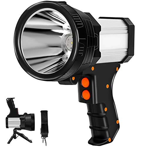
Best Waterproof Spotlight 2026 That Outshines Expectations

Best Solar Spotlight For Yard 2026 Brighten Outdoor Spaces With Ease
Best Led Spotlight Rechargeable 2026 Bright Picks

Best Rechargeable Spotlight For Boat 2026 That Cuts Through Darkness